You’re not alone. Standing in front of your closet. Stare at those clothes. Nothing pairs well. You feel stuck.
Here’s a quick test: What color shirt are you wearing right now?
Does it make your skin glow or look dull? That’s not random. There’s science behind it. Color theory clothing gives you a system. Not fashion rules.
Not complicated formulas. Just practical knowledge that makes dressing easier. In this guide, you’ll get outfit combinations that actually work.
You’ll match colors to your skin tone. You’ll dress confidently for any occasion. Think of one outfit you love. Got it? I bet the colors work perfectly together. Let’ss start with how colors interact in your wardrobe.
What Is Color Theory in Fashion?
Color theory is a framework that explains how colors interact and combine. It started in art and design. Sir Isaac Newton created the first color wheel in 1666, and that same tool now helps you get dressed every morning.
The color wheel organizes colors in a circle, showing their relationships. It tells you which colors complement each other, which ones clash, and which create harmony when worn together.
But here’s what most guides miss: color theory in art focuses purely on visual impact. Color theory in fashion goes deeper. It considers your skin undertone, your hair color, your eye color, and how light reflects off different fabrics.
A color that looks stunning in a painting might wash you out completely. That’s why seasonal color analysis exists.
Key Terms to Know:
- Hue: The pure color itself (red, blue, yellow)
- Tint: A hue mixed with white (lighter versions)
- Shade: A hue mixed with black (darker versions)
- Tone: A hue mixed with gray (muted versions)
- Saturation: How intense or muted a color appears
- Undertone: The subtle warm or cool quality beneath a color
Understanding these terms helps you see why two “blue” shirts can look completely different on you.
The Color Wheel and Your Wardrobe

The color wheel contains three categories that form the basis of every outfit combination you’ll ever create.
Primary Colors
Red, blue, and yellow. These cannot be created by mixing other colors. In your wardrobe, they make bold statements. A true red dress commands attention. A yellow blazer energizes a neutral outfit. Navy blue projects quiet authority.
Secondary Colors
Orange, green, and purple. Mix two primary colors, and you get these. They offer softer alternatives to primaries while still carrying visual weight. Think forest green trousers, plum sweaters, or burnt orange accessories.
Tertiary Colors
Red-orange, yellow-green, blue-violet, and others. These bridge primary and secondary colors, adding subtle depth to your outfits. Teal, coral, chartreuse, and burgundy fall into this category.
Color Schemes That Work
Four color relationships do the heavy lifting in any wardrobe. Here’s how each one works.
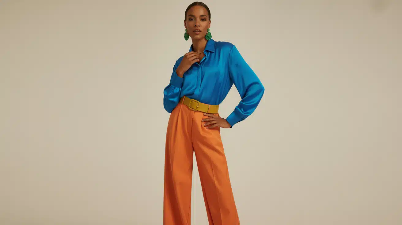
1. Complementary Colors
Colors opposite each other on the wheel. They create high contrast and visual energy.
- Navy + rust
- Purple + mustard yellow
- Teal + coral
Use one as your dominant color, the other as an accent. A navy suit with a rust pocket square. Purple earrings with a mustard dress.
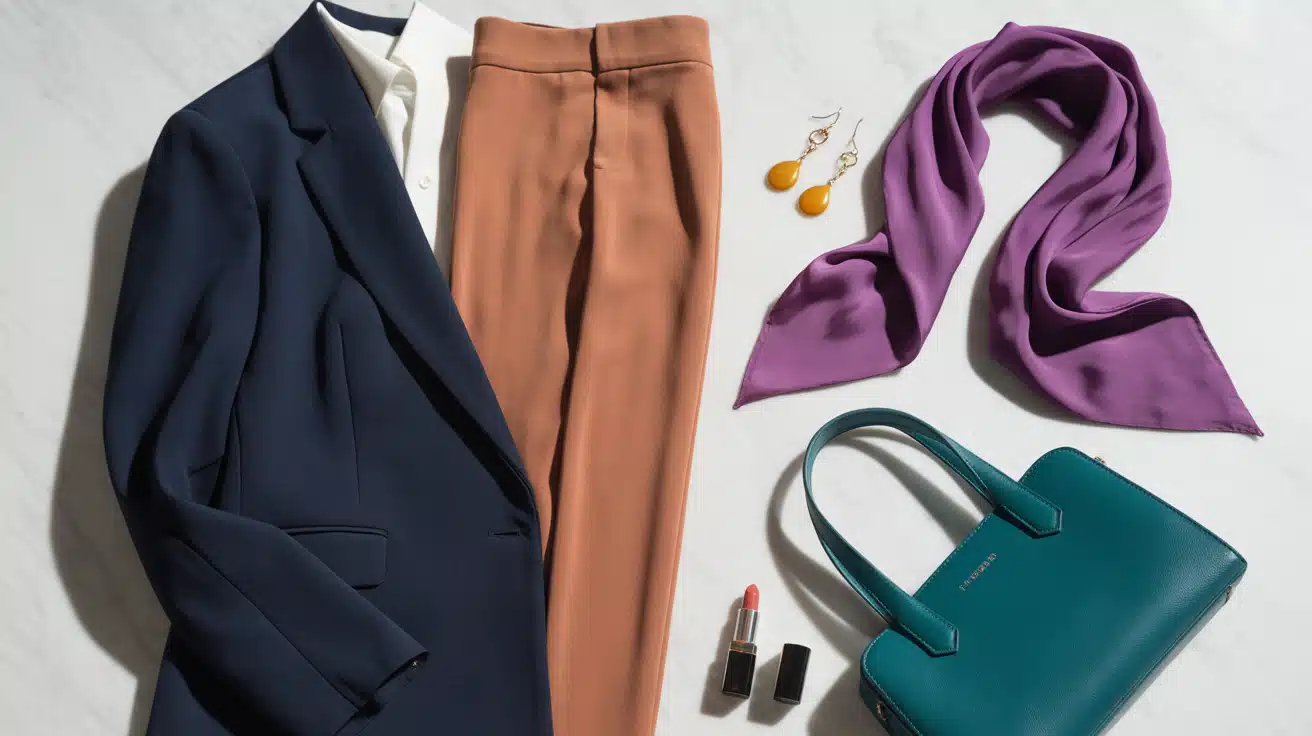
2. Analogous Colors

Colors sitting next to each other on the wheel. They create smooth, harmonious transitions.
- Blue + teal + green
- Red + orange + coral
- Purple + blue + indigo
These combinations feel cohesive and sophisticated. Think of an ocean sunset palette for summer or forest tones for autumn.
3. Monochromatic Colors

One color in different shades, tints, and tones. This creates an elevated, polished look.
- All-navy from light chambray to deep midnight
- Varying grays from silver to charcoal
- Cream to camel to chocolate brown
The key is mixing different values and textures to avoid looking flat.
4. Triadic Colors

Three colors are equally spaced on the wheel. This creates balanced energy without the intensity of complementary schemes.
- Red + yellow + blue
- Orange + green + purple
Best used with one dominant color and two accents.
Why Some Colors Make You Glow (And Others Don’t)
Have you noticed certain colors make you look tired while others brighten your whole face? This isn’t imagination. It’s color science.
When a color shares similar undertones with your natural coloring, it enhances your appearance. Your skin looks healthier, your eyes appear brighter, and your overall look comes together.
When a color clashes with your undertones, the opposite happens. You look washed out, tired, or sallow. Dark circles appear more prominent. Your skin loses its natural warmth or coolness.
This is why your friend looks incredible in that coral top while you look like you haven’t slept in days wearing the same shade.
Building Your Personal Color Palette

Your skin undertone determines which colors make you glow or look washed out. This matters more than your actual skin color.
Three Undertone Types:
1. Warm Undertones
Have yellow, peachy, or golden hues. Gold jewelry looks better than silver on you. Earthy colors like olive, rust, and cream flatter warm skin.
Orange-based reds suit you better than blue-based reds. Browns and warm greens enhance your natural glow.
2. Cool Undertones
Have pink, red, or blue hues. Silver jewelry complements you better. Jewel tones like sapphire, emerald, and burgundy work well.
True white looks crisp on you. Purple and blue-based pinks are your friends.
3. Neutral Undertones
have a balanced mix. Both gold and silver suit you. You can wear most colors successfully. You have the broadest range of options.
Soft pastels and muted tones look great on you.
Quick Test Check your wrist veins in natural light. Green veins indicate warm undertones. Blue or purple veins suggest cool undertones. Can’t tell? Build your palette by selecting 5-7 core colors that flatter your undertone. Add 2-3 neutral basics (white, black, gray, beige). Include 1-2 accent colors for variety. |
Once you’ve established your personal palette, it’s time to apply these colors strategically across different clothing types and occasions for maximum impact.
Color Theory By Clothing Type & Occasion

Different settings call for other color strategies. Here’s how to apply color theory to clothing across your wardrobe.
1. Casual Wear
Everyday outfits give you freedom to experiment with bold color combinations.
- Use complementary colors for energetic looks (yellow tee with purple jeans)
- Try analogous schemes for smooth transitions (blue denim, green sweater, teal sneakers)
- Mix patterns with solid colors to balance visual interest
- Add accent colors through accessories like scarves or bags
2. Business Attire
Professional settings demand restrained color choices that project competence.
- Stick to muted tones like navy, gray, and burgundy
- Pair navy suits with light blue or white shirts
- Use subtle contrast with gray pants and wine-colored tops
- Avoid neon or overly bright colors in corporate environments
3. Formal Wear
Special occasions call for refined, sophisticated color pairings.
- Monochromatic schemes create timeless looks (all-black tuxedos)
- Deep jewel tones work for evening events (emerald, sapphire, ruby)
- Pair navy gowns with silver or gold accessories
- Keep color palettes simple and cohesive
4. Seasonal Wardrobes
Align your colors with nature’s changing palette throughout the year.
- Spring/Summer: Lighter, brighter hues (coral, mint, sky blue, lemon yellow)
- Fall/Winter: Deeper, richer tones (burgundy, forest green, burnt orange, chocolate brown)
- Match your wardrobe to seasonal landscapes for natural harmony
Color choices do more than create visual appeal. They influence how you feel and how others perceive you.
Let’s analyze the psychological impact of color in clothing
The Psychology Of Color In Clothing

Colors trigger emotional responses and shape how others see you. The right shades can boost your mood and confidence instantly.
Here’s what each color communicates:
| Color | Psychological Effect |
|---|---|
| Red | Energy, passion, power. Commands attention. Perfect for presentations. |
| Blue | Calm, trust, reliability. Ideal for interviews and client meetings. |
| Black | Authority, sophistication. Slim’s silhouette. Great for formal events. |
| White | Clean, simple, fresh. Approachable look for summer and casual settings. |
| Green | Balance, growth, calm. Grounding color with an optimistic feel. |
| Yellow | Happy, creative, energetic. Use as an accent. Too much overwhelms. |
Your outfit communicates before you speak. Choose colors based on the impression you want to make. Match your color to your goal for the day.
Wearing the right color can increase your perceived confidence by up to 30%.
Knowing color psychology helps, but expected missteps can undermine your efforts. Let’s identify frequent errors and how to fix them quickly.
Common Mistakes and How to Fix Them
Mistake 1: Too Many Contrasting Colors
Wearing multiple complementary pairs creates visual chaos. Your eye doesn’t know where to focus.
Fix: Stick to one complementary pair maximum. Balance bold colors with neutrals from your season’s palette.
Mistake 2: Ignoring Your Undertones
Choosing trendy colors that clash with your natural coloring makes you look tired regardless of how fashionable the piece is.
Fix: Always test colors against your face in natural light. If it drains you, it’s not your color, no matter what the trend reports say.
Mistake 3: Matching Everything Exactly
Head-to-toe identical color looks dated and flat. It eliminates visual interest.
Fix: Use varying shades, tints, and tones of one color. Mix different textures (matte, sheen, knit) to create depth within monochromatic outfits.
Mistake 4: Forgetting Fabric Affects Color
The same dye looks different on velvet versus satin versus cotton. Velvet absorbs light and appears darker. Satin reflects light and appears brighter. Matte cotton sits somewhere between.
Fix: Consider the fabric when planning outfits. A “matching” set in different fabrics might not actually match.
Mistake 5: Neglecting Neutrals
A wardrobe with only statement colors creates daily outfit struggles. Nothing anchors the bold pieces.
Fix: Build your foundation with your season’s neutrals. For warm seasons: cream, camel, olive, brown. For cool seasons: white, gray, navy, black. These multiply your outfit options.
Mistake 6: Wearing Black by Default
Black isn’t universally flattering. On warm, muted, or light seasons, it can be harsh and aging.
Fix: Find your season’s darkest neutral. Dark Winters wear black beautifully. Soft Autumns look better in chocolate brown. Light Summers shine in charcoal or navy.
Conclusion
Color theory clothing transforms how you dress. You’ve seen how the color wheel guides wise outfit choices. You know your undertone now. You can pair colors confidently for any occasion.
Start small. Pick one color scheme this week. Try a complementary combo or stick to analogous hues. Notice how the fabric texture changes the color appearance.
Avoid common mistakes like over-matching or ignoring your undertones. Your wardrobe should work for you, not against you. They help you communicate without words.
They make getting dressed simpler. Ready to revamp your closet? Test your undertone today. Build your personal palette. Start mixing colors with intention.
Share your favorite color combinations in the comments below. Which color makes you feel most confident?
Start choosing colors that truly suit you.